

2018 IBM Annual Report
INTRO
VSA Partners hired me to work on a digital annual report for one of their major clients – IBM. Taking a part in every phase of the project, I supported the team not only with visual design but also with interaction and user experience design improvements.
Navigation
The digital annual report was divided into stories showing how IBM helps its clients with the technologies they offer. In compliance with IBM’s Design Language, I defined the color palette and navigation style, suggesting the use of primary color for each story and adding a micro-interaction animation for the hover state.

Carousels
Since IBM Design Language does not include image carousels, I created an entirely new carousel solution by exploring a few different variations.


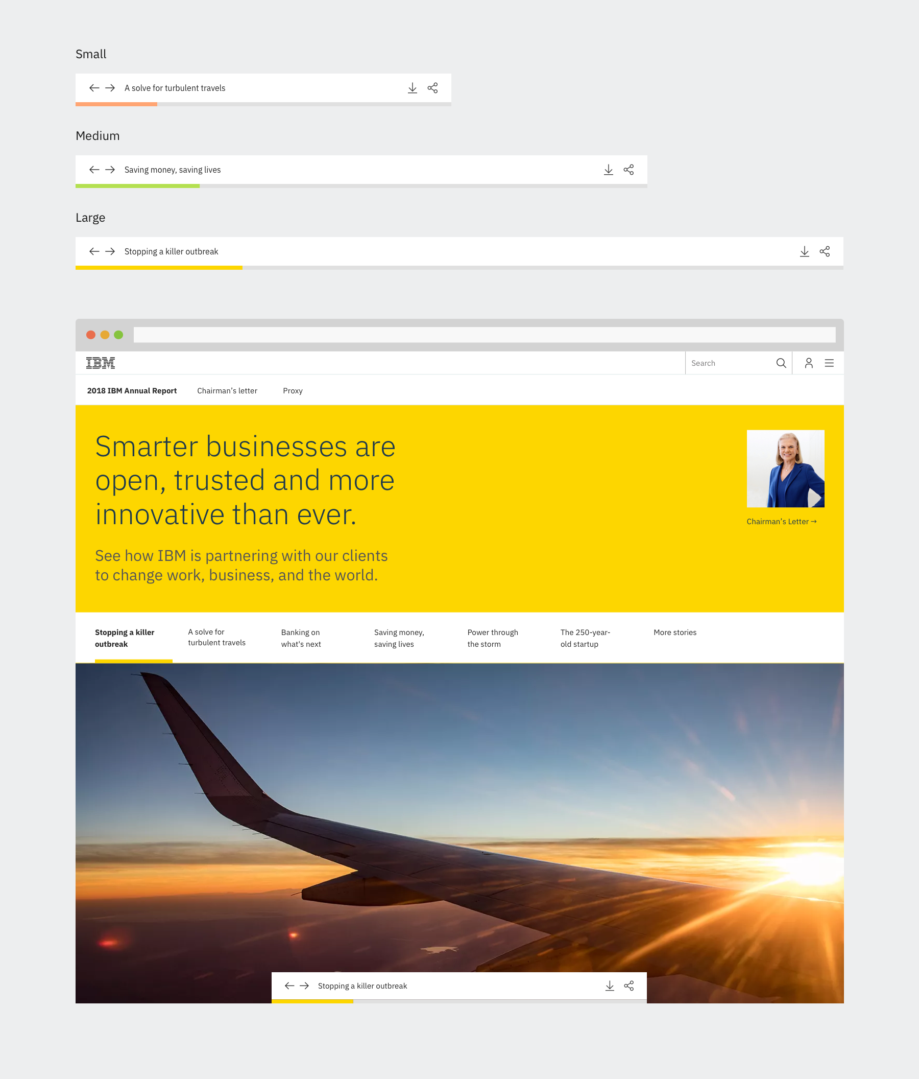
Reading Position Indicator
Taking into consideration that the stories are long, I suggested the addition of a sticky bar to the bottom of each page with the reading position indicator. That indicator would contain “next” and “previous” buttons for easier navigation, as well as the option to download and share the link of the Annual Report.

Data cards
In addition to other UI components, I designed the data cards that can be used on story pages.

Mobile Experience
The mobile option includes thumb-friendly bottom navigation with ‘Next & Previous’ buttons. I replaced icons with words to prevent a conflict with the browser interfaces.

Infographics
I worked closely with content writers and created infographics that illustrate the stories.
